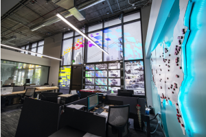
Just down the street from Airbnb, around the corner from Pinterest, and a few blocks from the new Warriors stadium, you’ll find the new home of ARC’s flagship San Francisco office.
ARC San Francisco made the move into the new space earlier this year in an effort to better serve its San Francisco customers. By making the move, ARC joined the vibrant, artistic Mission Bay community, home to the California College of the Arts.
The new space is ultra-modern and industrial with exposed ceilings and expansive walls and windows.
It was on those walls and windows that ARC’s Corporate Marketing Team, led by Sr. Director, Product Marketing, David Villarina, saw multiple opportunities to tell the evolving story of the ARC brand, showcase ARC’s production expertise, and improve the space.
Graphics as Dynamic as ARC
In collaboration with the ARC-owned creative production company, Riot Creative Imaging, the Marketing Team first identified the lobby area as an ideal space to display messaging that was as dynamic as ARC and its customers’ businesses.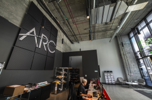
What they created (pictured right) is an ingenious magnetic tile format that made it possible to stitch together multiple tiles to create a much larger statement. This design is highly flexible in that, by simply printing out new three-foot by three-foot tiles, the face of the design could easily change at any time.
Moreover, because the design is made of separate sections, this format can be easily adapted to the space and design constraints of ARC’s Service Centers all across the country.
Local Service, Around the Nation
For regional, national, and international AEC firms with projects in various places, the ability to use ARC as their single source of printing services is a key difference-maker. So it was important to craft that message in a way that allowed customers to quickly understand the implications of ARC’s nationwide presence.
To that end, the team conceptualized, produced, and installed an illuminated map of North America on another lobby wall complete with red pucks to highlight every ARC Service Center location across the nation.
For an even greater impact, the graphic was framed by a window with frosted film depicting the outline of the North American map and messaging about ARC’s Service Center (image below). 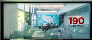
Design and Production Expertise Put to the Test
The final major component of this design project was the four bays of 40-foot by 40-foot, floor-to-ceiling windows that formed the facade of ARC’s San Francisco Service Center.
Clearly, this was the place to show ARC’s new flagship Service Center in its best light. But doing that required far more than a beautiful frosted window graphic.
In addition to their task to fill this space with visuals that simultaneously told ARC’s story, fit within the neighborhood, and recognized the city of San Francisco, the team would have to find a way to use the visuals to also provide shade for the Service Center’s occupants.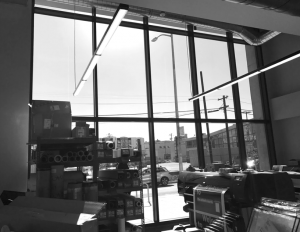
Normally, fixing the glare would be relatively easy by placing film on the outside of the window. However, because the city would need to review any changes to the building’s facade, property management said that nothing was allowed to be visible from the outside.
The Riot Creative Imaging team in Santa Clara immediately went about running several tests to determine the right amount of opacity for the window film they planned to install. The goal was to make the glass transparent enough that it would let in enough natural light so that new lighting wouldn’t be necessary but not so much light that it made the space uncomfortable.
Complicating matters further was the different angles at which the sun would hit the building as the day went on.
A Flagship Service Center Experience
Following Riot’s extensive testing, the team decided to apply a white film that decreased in opacity as it traveled down the window. The effect is a film that effectively blocks the sun where it’s at its most intense and lets the sun in where it provides a comfortable amount of natural light.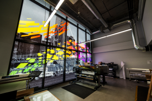
With this ingenious application of film by the team at Riot Santa Clara, the Marketing Team was free to create the visual that would serve as the centerpiece of ARC’s flagship Service Center.
They made full use of the space by designing an image of the San Francisco skyline spilling over all four window bays. Overlaid on top of the cityscape is a colorful injection of pixels.
“The pixels vary in size, trajectory, and movement to communicate the vibrancy and evolving nature of our business and our commitment to printing, technology, and our diverse set of clients,” said Villarina.
All at once, the graphic celebrates the diversity and vibrancy of the city, speaks directly to ARC’s printing and technology capabilities, and represents ARC’s new place in an increasingly digital world.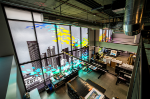
Looking Forward, Respecting the Past
Everything about ARC’s San Francisco Service is new.
The offices themselves were recently built, the surrounding neighborhood is rapidly growing, the interior design aesthetic is modern, and ARC is serving an increasingly forward-thinking customer.
But ARC’s history in San Francisco goes back decades… and that doesn’t just go away.
Along with providing technological capabilities to solve modern problems, ARC remains a leader in print and the San Francisco Service Center itself speaks to that.
