As shutdowns lift, the way we interact with our office spaces and each other will not be the same. For the foreseeable future, we’ll need to learn new habits.
The good news is, through thoughtful design, our workplaces can act as powerful enablers of our new way of working.
Because of that opportunity, we hosted a webcast featuring three experts in interior, architectural, and graphic design:
- Ashley Kolar, Director of Graphic Design at PBK Architects
- Brad Williams, President and CEO of RDC
- Christy Kain, Vice President of ASD|SKY
While you should watch the webcast in full on this page, this post will outline 4 key takeaways from the webcast including expert tips on graphic and interior design, operationalizing your back-to-work plan, and more.
Graphic Design Tips: Less is More and Bigger is Better
Human beings like to ignore information that overwhelms them. It’s far easier for our brains to tune out lots of information than it is to make sense of the data.
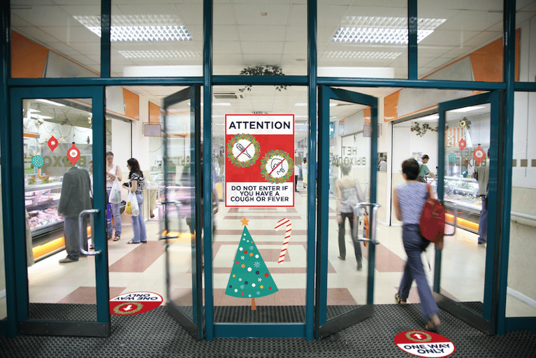
During the webcast, Brad Williams explains that, if you use so many graphics that your audience becomes overwhelmed, your message can’t hit its mark. Building on that idea, Ashley Kolar explained that rather than use many small pictures and fonts, designers should opt for a relatively smaller number of large, simple graphics. This, she said, enables your graphics to capture attention where it’s needed.
This approach also makes it easier for building occupants to read and comprehend your signage while they’re on the go. With more complex, smaller signage, your audience is less likely to get the message because they’ll be forced to stop what they’re doing and look.
Another design mistake to avoid, according to Kolar, is to avoid overdoing it on alarming colors, such as red or yellow. Kolar clarified that the point isn’t to avoid using red or yellow completely, just that you need to be thoughtful with how much of it you use.
Messaging: Keep it Light, Helpful and Audience-centric
The conversation shifted from design to messaging, and Christy Kain emphasized the need for audience-centricity in signage. More specifically, she talked about how important it is for designers and writers to create messages tailored to their audience.
For example, signage you create for an elementary school would be much different than signage for a high school. But it’s not because an elementary and high school are vastly different facilities. Rather, it’s because the audiences in those facilities are so different.
Building on the theme of audience-centricity, Kain cautioned against fear-mongering. She explained that we should recognize that people are scared enough already. Generally, they know what they’re supposed to do but may need direction and reminders for different areas.
Relearn How to Plan Your Space
Another key point of discussion for the entire panel of experts was the many new ways in which people need to act when they come back to the office. For example, training spaces which used to fit 50 people may only have enough space to fit 10 people while maintaining social distance.
Moreover, people will naturally start to use their office spaces differently, given the constraints created by the need for health and safety. Space and graphic designers will need to monitor how their space is being used and adjust signage and design features accordingly.
One way Williams is addressing this, he explained, is by focusing on user experience. He suggests walking into your space as though you’re a staff member to think through where signage might be necessary. You can do the same exercise as a client, a delivery person, or a cleaner.
Carefully Assemble Your Return-to-Work Task Force
Near the beginning of the webcast, we asked the audience, “Which departments should be included in a “return to work” task force?” Audience members were allowed to choose multiple answers—these were the poll results:
- Human Resources/Admin: 87%
- Marketing: 50%
- Facilities: 85%
- C-Suite: 61%
- IT: 60%
For the most part, the panelists’ recommendations regarding a return-to-work task force actually mirrored the audience’s opinions. However, the panelists were surprised at the relatively low number of audience members who identified the C-suite as important members of their task force.
The panelists agreed that executive involvement and buy-in was critical to the success of return-to-work plans. Not because executives can do the job of returning to work better, but because their engagement helps lend authority and credibility to the return-to-work effort.
That authority and credibility because, as Kain pointed out, returning to work safely requires significant change management.
Listen to Your Staff and Your Local Authorities
Your space, whether it’s a retail environment of an office, is defined by how people use it. When we return to our public spaces, people will use those spaces differently. But it’s not enough to watch, you have to listen too.
Kain suggested finding out what’s concerning your staff and capturing and addressing the top three or four most common concerns. That way, people know you’re listening to them, hearing their worries, and acting.
Similarly, return-to-work task forces must act in accordance based on the guidelines and laws set out by their particular state, county, and city. We’re facing serious, complicated challenges as it relates to returning to work. And while our panelists’ perspectives are meant to inform and educate, their ideas do not supersede the advice of your local authorities.If you need signage to ensure your workplace is safe for your staff and clients, take a look at our return-to-work COVID-19 graphics.


